current design
ACURE Beauty Packaging Redesign
In Packaging design, I worked on redesigning ACURE beauty. This is a Natural cosmetic brand that has taken off since its launch in 2011.
“WE ARE SKIN & HAIR WELLNESS ENTHUSIASTS who believe in the power of purity to uplift the way you feel. We want to see every action you take lead to a stronger, healthier, more vibrant you that is ready to kick ass and take names.”
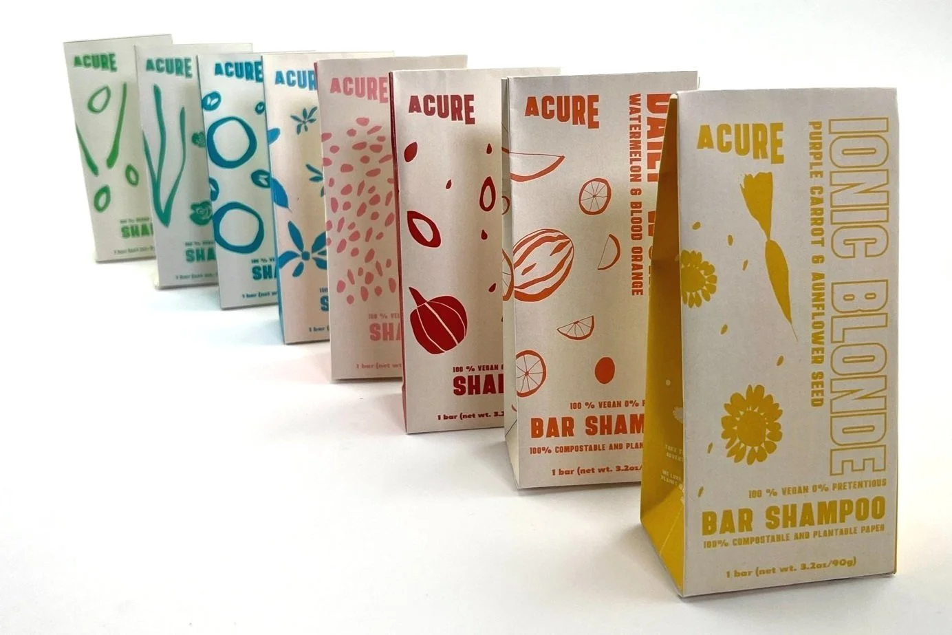
A large part of this brand is their use of natural, vibrant ingredients. Through the redesign process I invited myself to think more about how to use the vibrant color schemes ACURE has in a more abstract style way. Going forward, people are continuing to be more connected with brands that offer a playful, inviting feeling.
updated liquid bottle #1
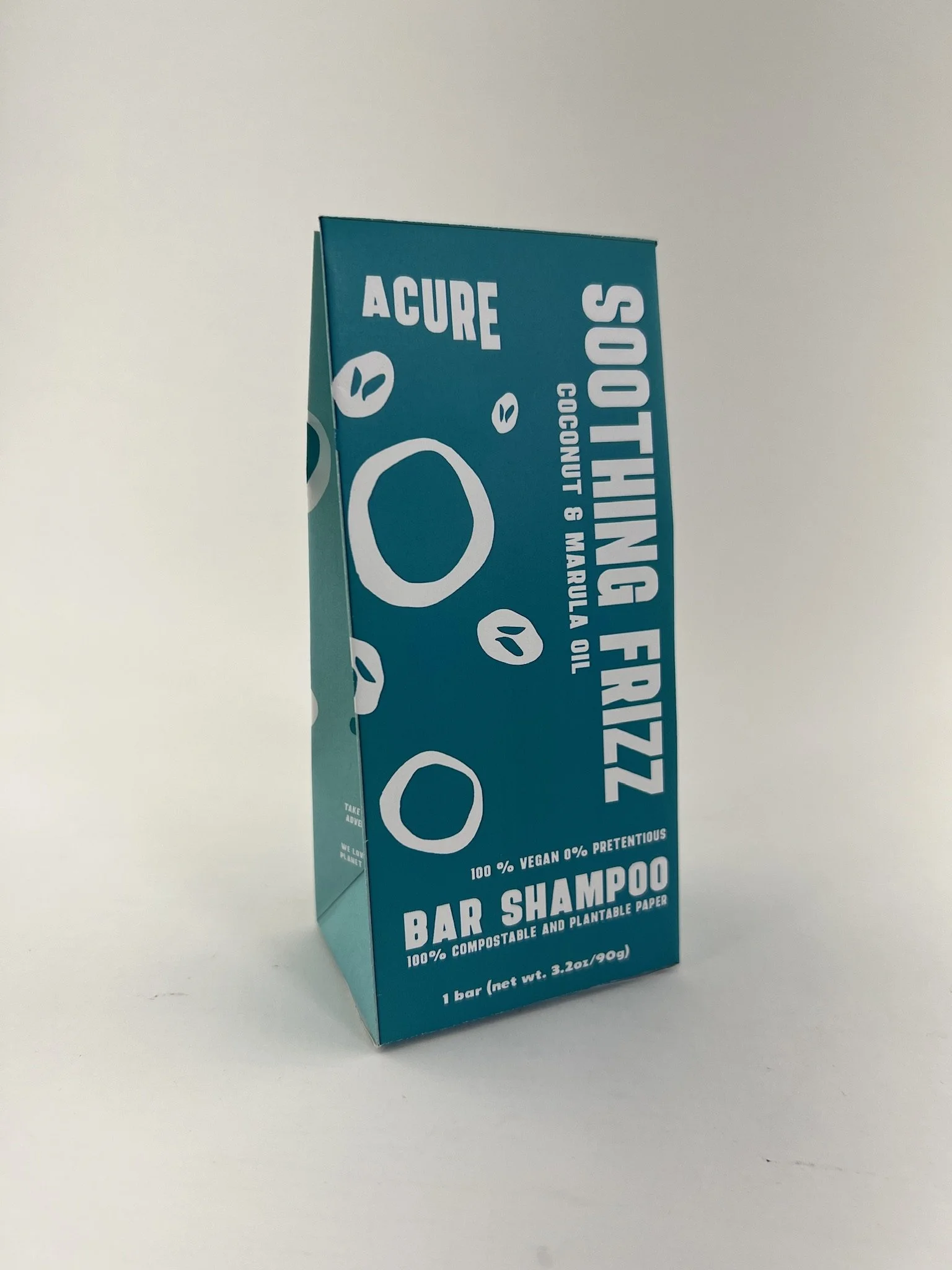
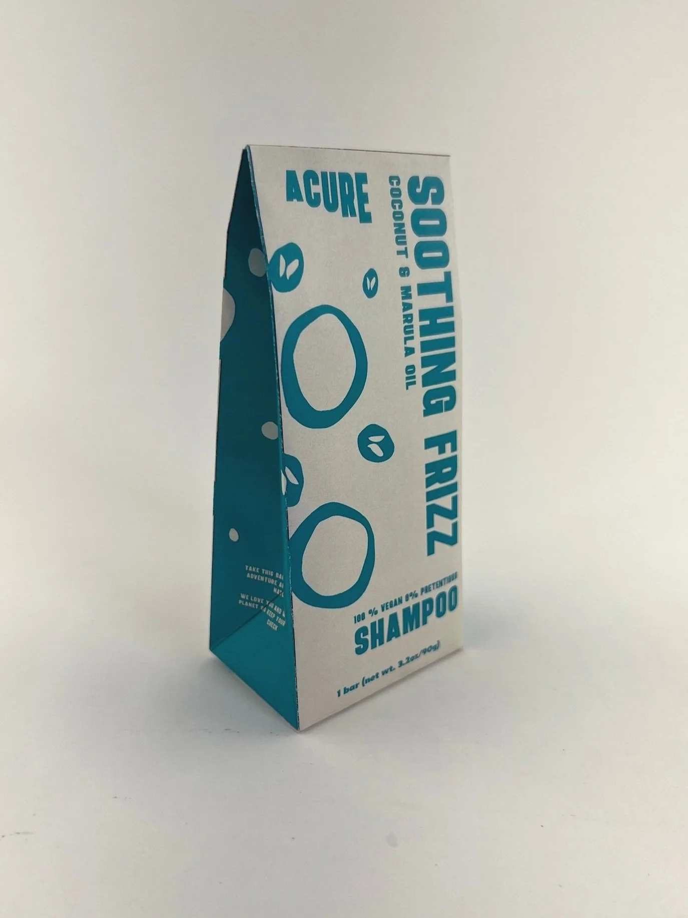
transition to bar shampoo and seed paper packaging
updated liquid bottle #2
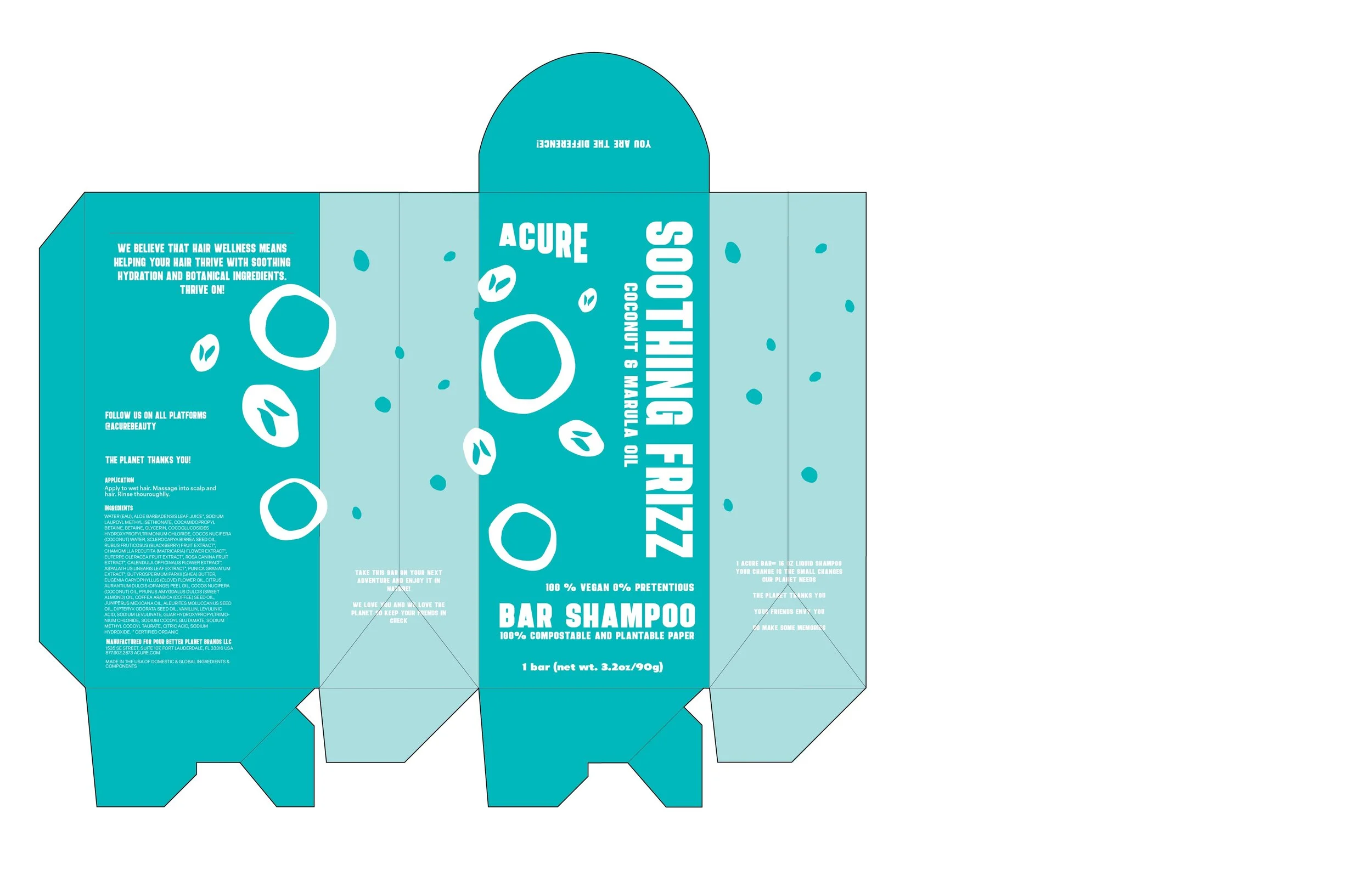
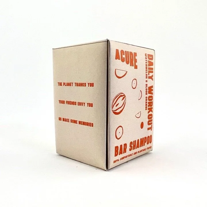
with this brand being so focused on sustainability, and getting closer to nature I felt it was only right to make a recyclable package. After the first paper Redesign I then transitioned to a minimal die-line made out of seed paper.
Left was the first, right was thinking about using less ink when printing.


